A logo is a very important visual business card. A well-designed one will make a single symbol immediately bring to mind a specific association: your company, website or initiative. A bad one… well, it will rather get lost in the maze of hundreds of others
On the surface it seems to be very simple – just the name of the company and simple graphics that will be associated with the profile of its activity. However, the devil is in the details. In this particular case, in simplicity which requires that each element of the logo has a strictly defined purpose and sense and every unnecessary particle is immediately rejected.
It is above all a message! That’s why you should find a symbol (or word) that unites your company’s values, its message and what you can offer your customers. Think about what message you want to send to the world. It can be helpful to create a mind map and write out, for example, a few keywords that are relevant to your business
However, the logo is not supposed to tell the whole story, but rather be a hint and an encouragement to delve into further “reading”. How to create them?
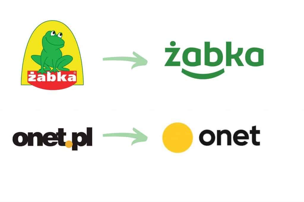
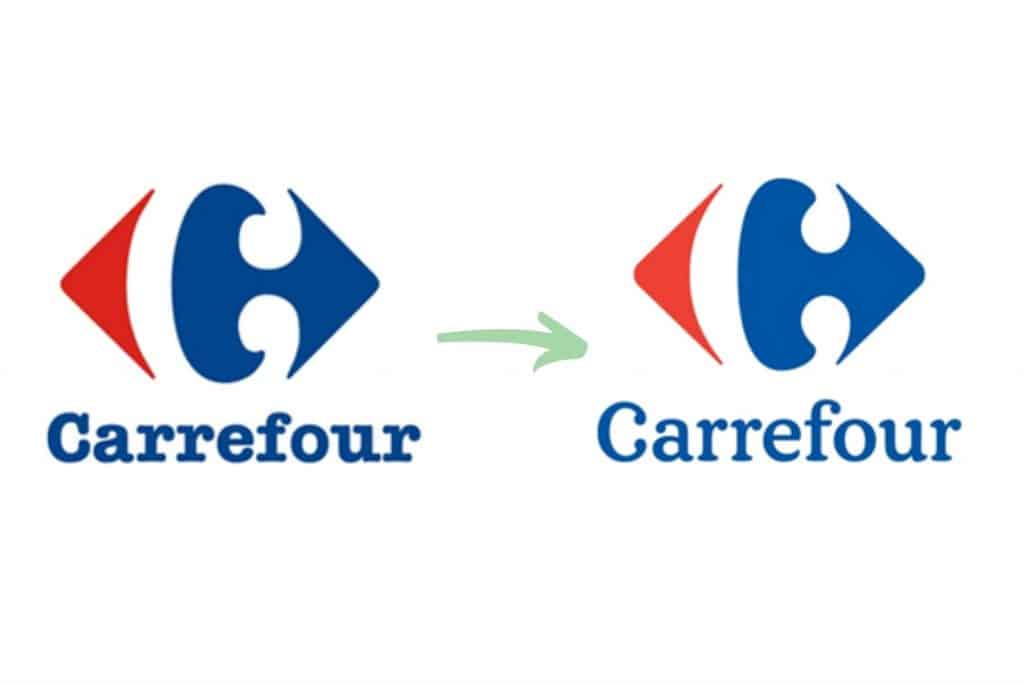
I have already mentioned simplicity. It is simplicity that gives a chance for your symbol to be memorable and build lasting associations. Notice how many companies have simplified their logos over the years.

Look at those logos that have been on the market for a good few decades and try to identify what makes them different and what, perhaps, was the key to their success
Remember who you are targeting with your message. The target audience is much more important even than your personal preferences and likes. Think about how old they are, what their budget is, what they like and how they spend their free time. This information can prove to be an important signpost
A clear message is important, but you don’t have to go for clichés. What does this mean? It means that the logo of a hairdresser may or may not include scissors, and a bakery – bread or baguette. Notice that there are no shoes in the Puma logo at all

There is a reason why some companies reserved shades of their logos (e.g. McDonald’s reserved its red and yellow, and BP – “its” green). Also be careful not to overdo it. Using three colors is the absolute maximum
On the one hand, you should stick to certain ironclad rules, but on the other hand it is worthwhile to stand out from the competition. Look at what elements and styles your rivals use, and then try to break out of the usual pattern. Example? If you offer organic products, you really don’t have to be the hundredth company to use the leaf symbol in your logo
You never know what direction your business will take, so consider as many different scenarios as possible and keep your logo versatile
A designer’s taste is seven years ahead of the public’s, and a designer who wants to be successful should be four years ahead of the general public
David Airey
Think about how it will look vertically and horizontally, whether it can be reproduced on multiple types of material, and whether it looks good in different sizes. The watchword: scalability!
A universal and well-designed logo will be a bit like an open book where you can always add something. It will stay firmly in the minds of its recipients, but will also allow for minor metamorphoses

Of course, there are quite a few free graphic design programs with which you can create a logo on your own. However, looking at the list of requirements above, think carefully about whether you are up to such a challenge on your own. It is not an element worth saving on
What would you add to the list of golden rules in logo design? Or maybe any of the listed does not agree with your idea?