Why did Opel change its logo?

Why did Opel change its logo?
It takes approx. 1 minutes to read this article

Many car manufacturers have decided to update their logos to stand out in the new digital and electrified era of cars, one such example is Opel.

– The new era needs modern brands, and modern brands need a clear design. With the new brand elements, we express our desire to be distinctive, progressive, and open to the future. – explained Opel/Vauxhall Global Head of Marketing, Patrick Fourniol.

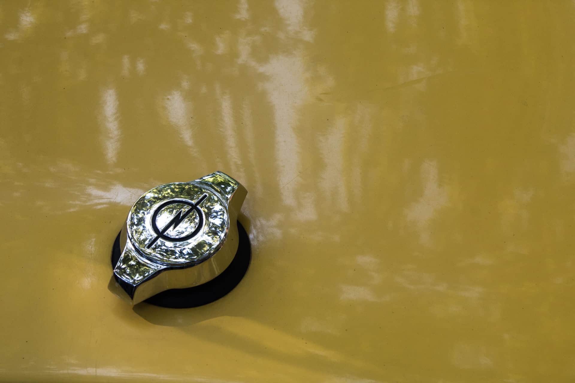
Opel has redesigned the logo, changing the background to a bright yellow color, which has been named Neon Opel Yellow, and a new font, Opel Next.

The circle is narrower than before, and the typeface is more modern and clear

The new color is meant to symbolize electricity, as it is the future of the industry. In fact, it would be hard to think of a better color for this purpose. Along with the striking contrast against the black logo, Opel Yellow certainly electrifies.

Main photo: Nikola Treći/unsplash.com

Add comment

Your email address will not be published. Required fields are marked *

*

Recommended articles
Not just TikTok! What is generation Z doing online?
We suggest where generation Z spends time online and how to use youth apps in marketing. Check it out!
The biggest mistakes of pusillanimous sales, or what scares your customers away?
What are the biggest mistakes of pushy selling? We check what you shouldn't do!
Everything you should know about omnichannel communications
Learn why your company should take an omnichannel approach to customer communications. Learn the benefits of multiple channels.
Latest articles